Understanding Color: A Practical Guide for Artists and Interior Designers
Insights inspired by Johannes Itten’s color theory
Color is never passive. It shapes how we read form, how we experience space, and how we respond emotionally—often before we are conscious of it. Few thinkers have articulated this as clearly and systematically as Johannes Itten, whose teachings at the Bauhaus laid the groundwork for how artists, designers, and architects still understand color today. His book The Elements of Color remains a cornerstone not because it dictates rules, but because it trains perception.
What follows is an interpretation of Itten’s ideas, translated into practical language for contemporary interior designers and artists, with a focus on how color actually behaves in real spaces and compositions.
Color Is Relational, Not Isolated
One of the most important ideas in Itten’s thinking is that color never exists alone. A color is always affected by what surrounds it. The same blue can appear calm in one setting and severe in another. A neutral tone can feel warm or cold depending on adjacent hues.
For interior designers, this means paint swatches are only the beginning. Color decisions must be evaluated in context—against materials, light, texture, and scale. For artists, it reinforces that color choice is inseparable from composition. Meaning emerges from relationships, not from single pigments.
The Color Wheel as a Spatial Tool
Itten’s twelve-part color wheel is often treated as a teaching aid, but it is also a spatial planning tool. It maps color relationships in a way that makes balance and tension invisible.
For interiors:
• Colors opposite each other on the wheel create dynamic contrast
• Colors close together create continuity and flow
• Triadic combinations introduce structure without rigidity
For artists:
• The wheel clarifies why certain palettes feel resolved while others feel unsettled
• It helps anticipate how color fields will interact once placed on a surface
The value here is not memorization, but awareness.
The Seven Color Contrasts and How They Translate to Space
Itten identified several fundamental ways colors interact. These contrasts are especially useful when thinking across art and interior design.
1. Contrast of Hue
Pure color differences—red against blue, yellow against green.
• In interiors: Best used sparingly to create focal points
• In art: Establishes clarity and directness
2. Light and Dark
Value contrast often has more impact than color itself.
• In interiors: Controls depth, openness, and intimacy
• In art: Defines structure and movement
A muted palette with strong light–dark contrast can feel more powerful than saturated color alone.
3. Warm and Cool
Warm colors advance; cool colors recede.
• In interiors: This affects how large or close a room feels
• In art: It creates spatial illusion and emotional temperature
This contrast is especially effective in architectural spaces where depth needs to be managed visually.
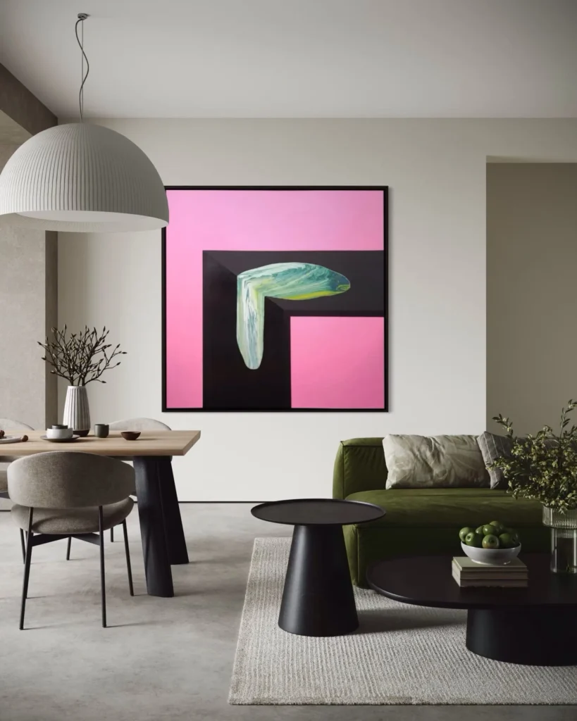
4. Complementary Contrast
Opposites on the color wheel intensify each other.
• In interiors: Often softened through texture or material
• In art: Used to generate tension and visual energy
Uncontrolled complementary contrast can feel aggressive; moderated, it becomes purposeful.
5. Simultaneous Contrast
Colors influence their neighbors, causing shifts in perception.
• A neutral wall can appear tinted depending on nearby artwork
• A color field in a painting can vibrate because of adjacent tones
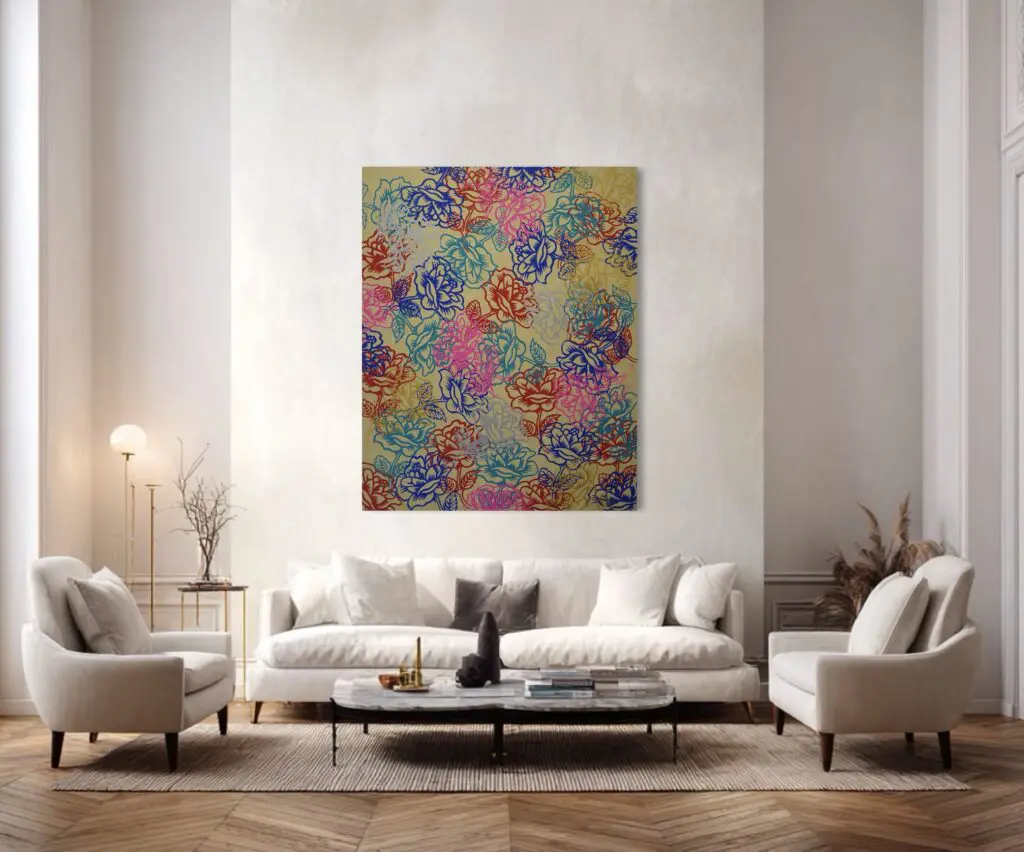
This is why art placement in interiors matters as much as the art itself.
6. Saturation
Pure color versus muted or diluted color.
• In interiors: Muted colors paired with texture create richness without overload
• In art: Saturation directs attention and hierarchy
Reducing saturation often increases longevity and adaptability in both disciplines.
7. Proportion
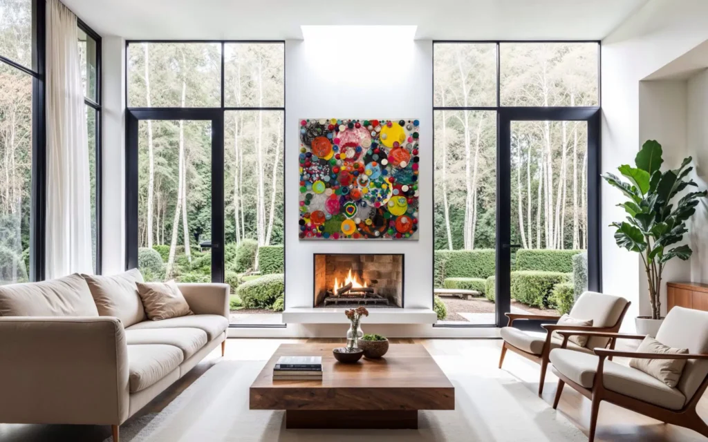
How much of a color is used matters as much as which color is chosen.
• A small amount of intense color can carry more weight than a large field of soft color
• This applies directly to statement artwork in restrained interiors
Proportion is often the difference between confidence and imbalance.
Color and Psychology: Experience Before Meaning
Itten believed color was felt before it was understood. This idea aligns closely with how people experience interiors and art today. Emotional response precedes analysis.
For designers:
• Color affects pace, restfulness, and focus
• It influences how long people want to stay in a space
For artists:
• Color guides the viewer’s eye
• It establishes mood without narrative
This is why thoughtful color use feels intentional, even when abstract.
Texture as a Moderator of Color
Color never exists without surface. Texture alters how color is absorbed, reflected, or softened.
In interiors:
• Matte surfaces quiet color
• Reflective surfaces intensify it
• Layered materials add depth without increasing chroma
In art:
• Physical surface changes how color is read
• Texture can amplify restraint or temper boldness
This intersection is where contemporary art and interior design align most naturally.
Applying Itten’s Thinking Today
What makes Itten’s work enduring is its flexibility. His ideas adapt to minimalism, maximalism, neutral spaces, and expressive compositions alike.
For interior designers, his framework supports:
• Confident color decisions
• Better dialogue with clients
• Art-forward spatial planning
For artists, it supports:
• Stronger compositional logic
• Greater control over emotional response
• Work that holds up across different environments
Color as Structure, Not Decoration
At its best, color provides structure. It organizes space, guides movement, and shapes experience. Whether on canvas or within architecture, color operates as a system—one that rewards intention and awareness.
Drawing inspiration from Itten is not about following formulas. It is about learning to see color as active, relational, and powerful. For artists and interior designers alike, this understanding transforms color from a surface choice into a foundational language.
When color is approached this way, it becomes timeless—not because it avoids change, but because it is grounded in how we perceive and inhabit the world.
Stay up to date with our latest news, events, and exhibitions!
We will process the personal data you have supplied to communicate with you in accordance with our Privacy Policy. You can unsubscribe or change your preferences at any time by clicking the link in our emails.
Inquire about the artwork
Please fill out the form and we will check the availability of the artwork for you